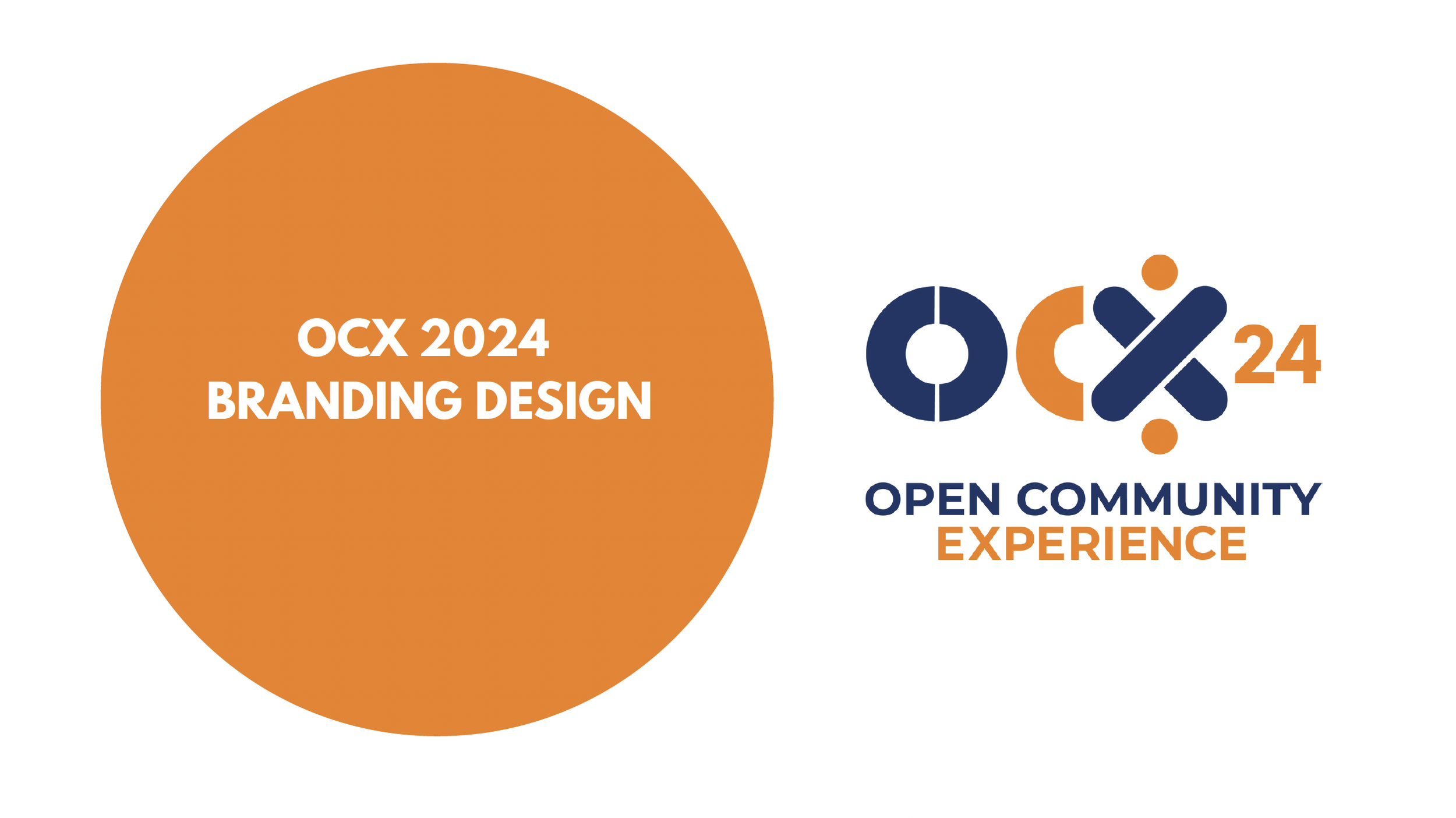
Designing Connection Through Visual Identity
When the Eclipse Foundation launched the inaugural Open Community Experience (OCX) 2024 in Mainz, Germany, it wasn’t just a new event—it was an ambitious experiment. For the first time, multiple communities and conferences were coming together under one umbrella. From automotive innovators to enterprise Java developers, each group brought its own culture, history, and expectations. As Creative Director, I faced a defining challenge: how do you design a brand that unites without flattening individuality?
Finding the Language of Unity
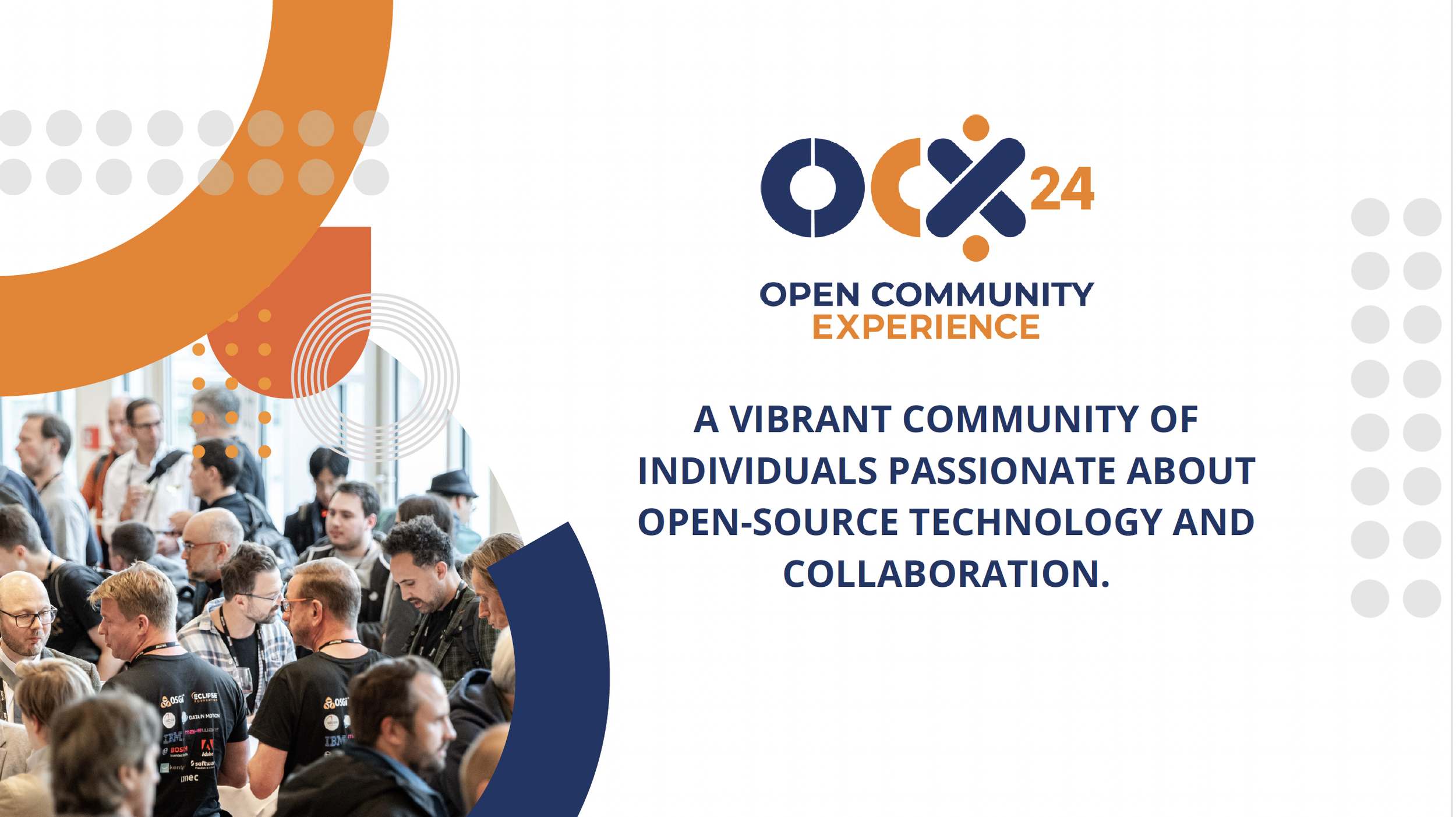
The diversity of voices made the stakes clear. A fragmented visual identity would dilute the event’s impact. A heavy-handed one would alienate the very communities we wanted to celebrate. We needed a visual system flexible enough to honor difference, yet cohesive enough to make OCX unmistakably recognizable. That’s where the concept began. I turned to circles and crescents—shapes that carry universal associations with connection, growth, and inclusivity. Overlapping forms symbolized collaboration across disciplines. A field of dots represented the individuality of each participant, while together forming a pattern greater than the sum of its parts. Shapes gave us the foundation. Color and typography gave us the voice.
We built a palette that was bold and vibrant, drawing inspiration from the working groups themselves, while keeping a core thread to tie it all together. The typography was deliberately modern and readable: a sans-serif that could scale from mobile banners to six-foot pillar wraps without losing impact.
Scaling a System to 100+ Touchpoints
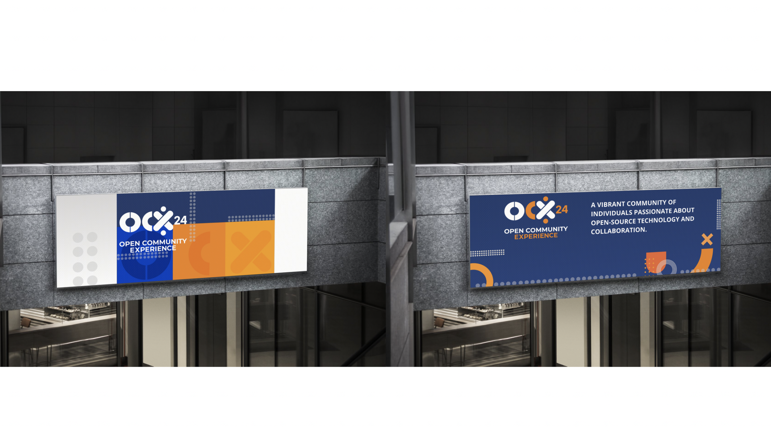
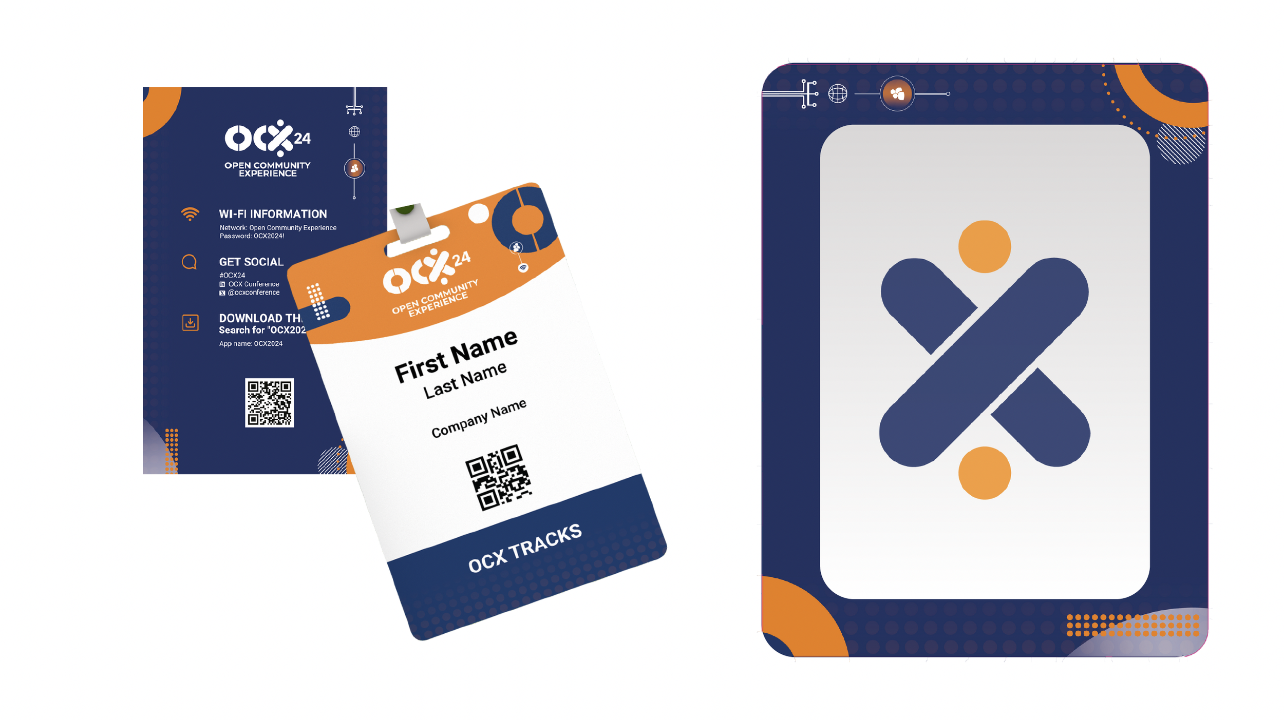
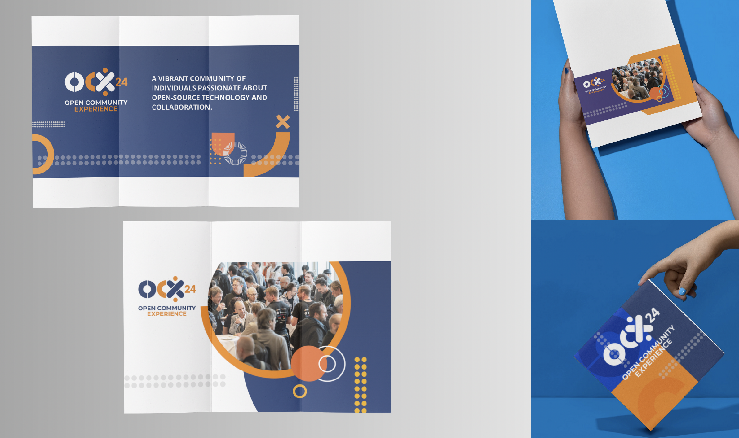
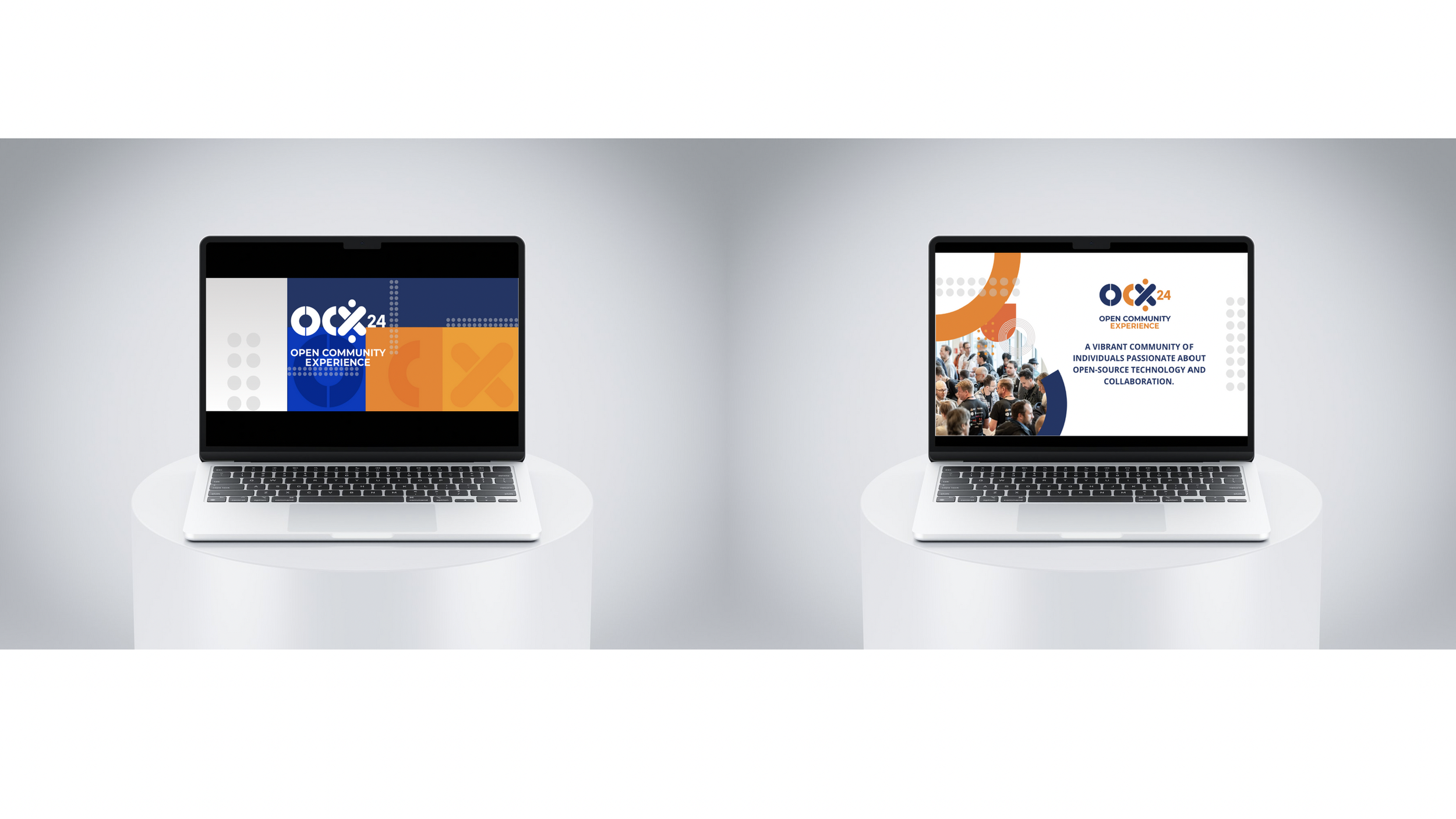
A concept is only as strong as its ability to stretch. For OCX, that meant rolling out over 100 distinct assets across every medium imaginable—digital campaigns, wayfinding signage, stage backdrops, video graphics, infographics, and environmental branding.
Every item carried the same DNA. The same visual grammar appeared in a tweet-sized social graphic and a building-sized wall installation. Consistency wasn’t decoration—it was the glue holding together an event that spanned multiple days, venues, and disciplines.
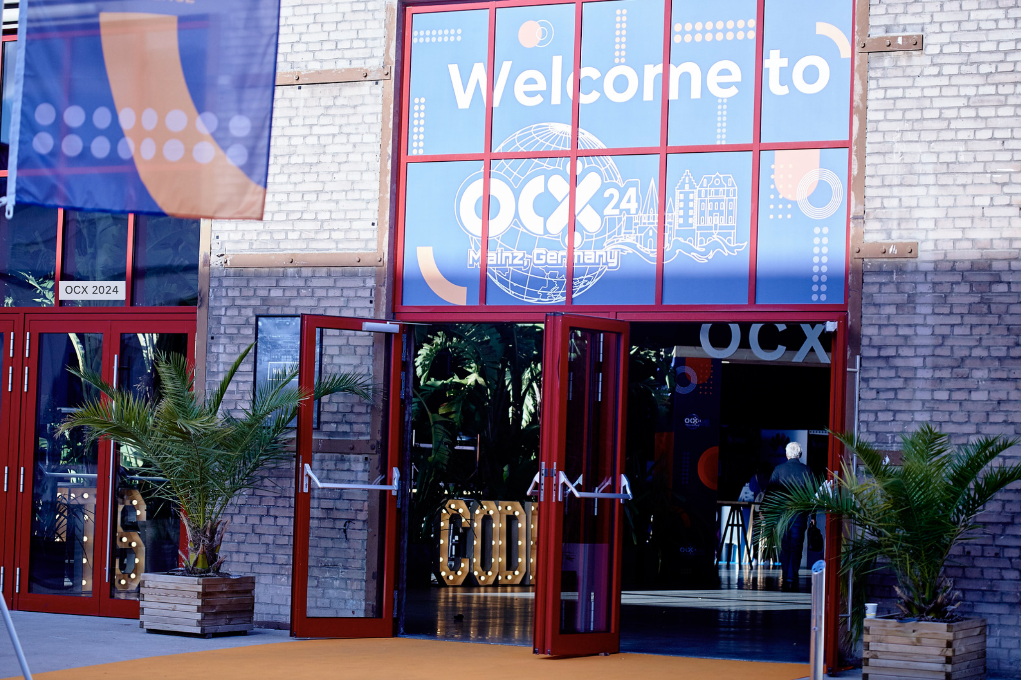
One of the most powerful applications was the paint-by-numbers installation: a mural blending the OCX mark with Mainz’s architectural icons and the Eclipse tagline, “It’s in our code.” Attendees filled it in collectively over the course of the event. The design literally invited the community to leave their mark—turning the identity from something they observed into something they co-created.
Immersion and Impact
The moment attendees arrived, the identity surrounded them—on directional signage guiding them through the venue, on the screens behind keynote speakers, even on pillar wraps anchoring the space. The environment itself told the story of unity and innovation.
The brand didn’t just decorate the event; it set the tone. Attendees described OCX as “energizing” and “welcoming.” The participatory wall became a hub of conversation, selfies, and spontaneous collaboration, proof that the brand wasn’t just seen, but experienced.
Lessons and Looking Ahead
Success wasn’t without its challenges. Aligning a diverse group of stakeholders early on proved more complex than expected, and creating so many bespoke assets within tight timelines demanded intense coordination. The design system held strong, but the process taught us where future iterations could be more efficient.
These lessons are already shaping the road ahead. As we prepare for OCX 2026 in Brussels, we’re building on what worked—cohesive symbolism, bold yet flexible systems—while introducing more modular templates to streamline production. The foundation is solid; now it’s about scaling smarter.
Closing Reflection
This was more than a design project—it was the beginning of a story. We turned abstract values like unity, growth, and collaboration into tangible, lived experiences. Every circle, crescent, and dot found its place in a bigger picture, just as every participant did.
For me, that’s what design leadership is about: not just making things look good, but making ideas visible, memorable, and shareable.